
The above graph uses the NYC Health EpiQuery data (Respiratory case counts) as of 11:50pm EST March 27, 2020 and the NYC Health & Mental Hygiene’s 2019 Novel Coronavirus (Covid-19) Daily Data Summary (tested positive Covid-19 and Covid-19 deaths) as of 4:00pm March 27, 2020. This page is updated regularly with new data as it […]
Category Archives: Observing what happens
Syndromic Surveillance & Covid-19 Resources

This article is part of the Syndromic Surveillance and Covid-19 collection on Thoughtfaucet. In the process of developing the Syndromic Surveillance Covid-19 NYC graph I gathered and read a variety of resources. Some of these are for specialist audiences and others are for more general audiences. This page is an annotated bibliography of the medical […]
Seeing Covid-19 in Influenza-like Illness, NYC 2020

This article is part of the Syndromic Surveillance and Covid-19 collection on Thoughtfaucet. This document outlines the thinking behind my initial chart, trying to see if there was anything to the idea that Influenza-like Illness could be used to spot Covid-19 in NYC. A thread on Twitter by Farzad Mostashari mentioned EpiQuery, a data collection […]
Some data on a 100 day content project: listens
Followers of this blog have probably been wondering what has taken over the site for the past 100 days. The 100 Days of Bass project is a fun content experiment I’m running. Initial listen data for the project regarding listening behavior of the audience Data on listening is coming from Soundcloud’s analytics. I have a pro […]
Mobile and desktop usage patterns
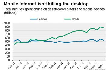
This chart shows the total number of minutes people spend online by device category–mobile or desktop. The dates are between February 2013 and April 2015, two years. I attempted to find the original Comscore post containing it but was unable to. The chart did, however, run in the Wall Street Journal so hopefully they sourced […]
Data, unique visits for three real estate aggregation sites according to Compete.com
Sometimes, when evaluating size and scope of market, it’s useful to look at the volume of traffic for some bellwether sites. In the US real estate industry, those bellwethers would be Trulia, Zillow and Realtor.com. Here are some graphs of their yearly traffic for 2012 as gathered from Compete.com’s SiteAnalytics product:
Inman’s Real Estate Connect and Agent Reboot NYC 2013 Twitter Hashtag, streamlined
Some friends and clients of mine asked me to streamline the Twitter channel for Inman News’ Agent Reboot and Real Estate Connect conferences. Here is the streamlined hashtag. Please note that none of the retweets in this stream should be construed as endorsements or non-endorsements. I simply retweeted items from the main hashtag which contained […]
Black Friday Sales Data 2012
This is a roundup of data gathered around the 2012 Black Friday sales event, with a special focus on online sales data. Every year when the data comes out there are dribs and drabs scattered across a wide variety of studies, sites and posts. I’m going to aggregate them here. Black Friday 2012 Timing Data […]
Some data on human behavior in a Twitter community
Recently BloombergTV has decided to use the #BTV hashtag to promote special events on their channel. This post contains some data regarding one such event. Those who have read articles here for some time will be familiar with the ongoing experiment in digital community known as “the #BTV hashtag.” The short version is that, since […]
The six things people do when they see your sponsored Facebook post on their mobile device.
A quick illustration of how misaligned or non-existent strategies yield new and interesting results.