Mobile and desktop usage patterns

This chart shows the total number of minutes people spend online by device category–mobile or desktop. The dates are between February 2013 and April 2015, two years.

Between February 2013 and April 2015 time spent online with a desktop machine remained steady, neither decreasing nor increasing noticeably. Time spent online with a mobile device increased during that time. The chart is sourced from Comscore

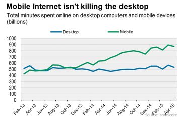
I attempted to find the original Comscore post containing it but was unable to. The chart did, however, run in the Wall Street Journal so hopefully they sourced it properly.

There are many things that a chart like this could mean. For now, I just want to post this as data, an observation. Later, I’ll write more about the context and how one might orient this data.

Also, if anyone knows the original Comscore report that featured this data please let me know. I expect the WSJ to do a reasonable job sourcing but I like to see the original when possible all the same. Some publishers treat their blog product in a different manner from their “regular” content.

Migrant

This post is part of a series on nearline future technologies and how they might impact living. I hope that, in addition to being enjoyable to read, they encourage you to think about how technology will effect the people you work with and for.

The truck was packed, the door latched, and off it went. Jim went through the house one last time to make sure the dataports on the upstairs and basement were sealed and to do the final log out of the systems. A quick look at the pool and back house, questioning his judgement briefly, and then out front to his waiting car.

He watched the Continue reading “Migrant”