One of doing this might be to examine previous flu seasons and show what that workload was like relative to the current environment.
With this goal and data in mind I crafted what I’m going to call a loadband. Not to be confused with the excellent chamber music group Loadbang (recommended listening when you want something other than all of this to think about).
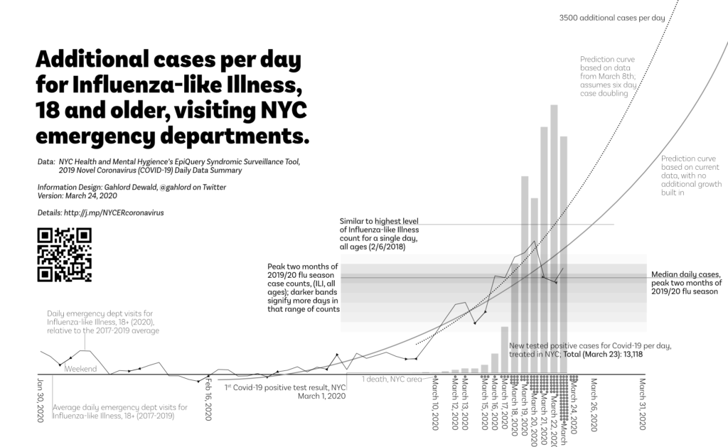
To make this loadband I took the data for the peak of the previous flu season: Dec 12, 2019-Feb 15, 2020 from EpiQuery (NY Health & Mental Hygiene). I found the median case count for that period and set a solid line.
The case counts per day for this time period ranged from the 400s to the 1100s. I made bands that were 100 cases tall and set the darkness of each band relative to how many days had cases/day which fell within that range.
In this way, readers can see that the peak of the immediate preceding flu season had quite a few cases per day and that at the peak they tended to range more in the 900s and up.
My hope with the loadband is that it gives a sense of what an emergency department has done in the past over a sustained period of time so we know when they are exceeding past performance and in entirely new territory.
Comments are closed.