The above graph uses the NYC Health EpiQuery data (ILI case counts) as of 1:47pm EST March 24, 2020 and the NYC Health & Mental Hygiene’s 2019 Novel Coronavirus (Covid-19) Daily Data Summary (tested positive Covid-19 and Covid-19 deaths) as of 9:45am March 24, 2020.
This article is part of the Syndromic Surveillance and Covid-19 collection on Thoughtfaucet. In particular see the Caveats section.
Discussion
While case counts are up today vs the weekend (which is common in how we interact with the medical system culturally), they rise isn’t as steep as it was after the previous weekend. Today is the first day since this project began that estimates of crossing the recording-breaking levels of ILI have moved further away, into the future.
This follows on Dan Weinberger making note that there was a change in the data available via his modeling yesterday:
Respiratory cases, however, continue to increase. So perhaps this decline in rate of change is a result of messaging re: staying home for cough/fever is getting through.
At the current pace, sometime around March 26th emergency departments could begin seeing back-to-back record numbers of case counts per day.
As of March 18, 2020 emergency departments were operating at the peak of this year’s regular influenza season. Importantly, the work required–staff protective equipment, room and equipment cleaning, etc–of the emergency department is much more intense than a regular influenza season (see Offenhatz and Newman in resources below).
If the experience of Wuhan or Italy are an accurate guide, the case count will continue to increase for 12 days after drastic social distancing (i.e. lockdown) conditions are obtained in NYC.
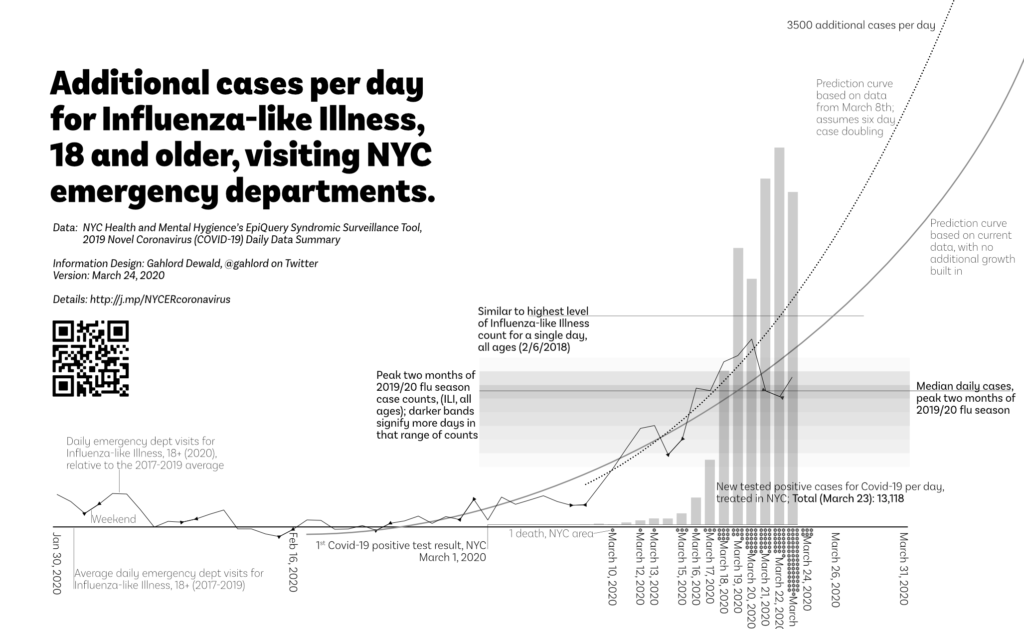
In this graph we see two predictions based on data from NYC Health and Mental Hygiene.
- Predicted case count above average (2017-2019) if cases before the first NYC-area death was announced are Covid-19 related: dotted curved line. This prediction did not come to pass.
- Predicted case count above average (2017-2019) if case count grows according to the trend without any multiplier: solid gray line.
For reference, the case count of the heaviest day for Influenza-like Illness is included.
There is also a loadband showing the typical cases-per-day of ILI, all ages, during the peak of the 2019/2020 flu season (which actually ends just as this chart is beginning).
These two elements provide a measure of how burdened the emergency department is relative to other challenges they’ve overcome.
Worried people
Even if the unusual lift in Influenza-based Illness, 18+ this year is not related to Covid-19 (for example, if it is people who are worried but do not in fact have Covid-19) it will still place a burden on the system. These patients will still take up time with staff administration, being examined, processing paperwork, and being nervous. Given the current lack of Covid-19 testing access these individuals may also face unnecessary quarantine, follow-up, etc.
“It’s important to know that in a busy New York City emergency department, it can be a huge drain on resources to have all these people show up at the ER at once to get tested.”
—Anonymous ER Doctor, interviewed in Gothamist, March 13, 2020
If cases presenting at NYC emergency departments are, in fact, worried people without the requisite symptoms then it would make sense to examine measures which relieve unnecessary public worry and the burden on the emergency department.
Ways to determine this might include:
- Qualitative assessment of emergency department: talk to staff about the nature of the current rise in case count.
- Examine diagnosis/outcomes of cases. EpiQuery tells us that someone has checked in but does not tell us if they turned out to be sick of Covid-19 or any other illness.
Covid-19 Patients
The graph includes a bar chart section which shows, to scale, the positives count of the current testing being done in NYC. It is to scale with the other elements of the chart.
Soon, NYC emergency departments may be at record-breaking loads for Influenza-like Illness. Unlike a normal record-breaking day for an influenza season each day will be followed by another record-breaking day. It will continue like this for 12 or days after meaningful social distancing is practiced by everyone who is in or enters NYC.
During this time, patients would then filter further into the health system absorbing resources, space, and staff. How many record-breaking days of Influenza-like Illness intakes in a row can the medical system absorb?
This is the trajectory that was faced by Italy which lead to collapse of medical services and complete shutdown of the country. We know from the experience of Wuhan that once a complete shutdown occurs case counts will continue to rise for 12 days (JAMA February 24, 2020).
Importantly, Mayor DiBlasio notes that at the current rate NYC will run out of ventilators in the next ten days. Had “extreme” social distancing measures been implemented even two or three days ago the turnaround in cases would begin in time. Now we’ll have something truly extreme: people who would have lived otherwise will die because states will be unable to obtain ventilators.. There are no more ventilators to be had nor will they be built in time.
Definitions related to Estimating Future ER Load graph:
The heavy solid curved line is a trend line of current actual data. It’s a 3rd order polynomial. The actual data is the moving, lighter weight solid line beneath it. These points are calculated for each day based on the following from EpiQuery: ((ILI 18-64 2020)+(ILI 65+ 2020))-(Average((ILI 18-64 2017)+(ILI 65+ 2017)),((ILI 18-64 2018)+(ILI 65+ 2018)),((ILI 18-64 2019)+(ILI 65+ 2019))). Triangular points on the lighter weight line enclose weekends.
The dotted curved line is a prediction based on data through March 8, 2020–two days before the first NYC-area death and assuming the Covid-19 case doubling of every six days (The Lancet, Jan 31, 2020). This line is made by taking the March 8, 2020 data point from EpiQuery, doubling it every six days. It is a 3rd order polynomial trend line.
The gray solid line is a prediction based on all current data but makes no assumption related to Covid-19. It is a 2nd order polynomial trend line.
The bar chart shows the confirmed cases per day made by subtracting a given day’s total case count as reported in NYC Health & Mental Hygiene’s 2019 Novel Coronavirus (Covid-19) Daily Data Summary and subtracting the measurement obtained in the previous day.
Dots along the bottom indicate one death each. These are currently gathered via NYC Health & Mental Hygiene’s 2019 Novel Coronavirus (Covid-19) Daily Data Summary.
The loadband is a series of shaded bands. The darkness of the band indicates the number of days that many cases of ILI, all ages were generated within the Dec 12, 2019-February 15, 2020 timeframe. A median line is also present. This element is then transposed to the relevant date range and baseline. This loadband summarizes the peak months of the 2019/20 flu season activity for emergency departments in NYC. Data source is EpiQuery.
The baseline is an average of people 18 and older, presenting Influenza-like Illness at a NYC emergency department 2017-2019. All lines and bars are relative to this figure in order to show variation from normal seasonality.
FAQ on the Coronavirus/Covid-19/ER graph
- Is this all the deaths caused by Covid-19 in NYC? No. Covid-19 response takes up staff resources and ventilators etc. There are people who do not have Covid-19 but will die because there are no more ventilators left for them, no clean rooms to perform emergency procedures, no staff available to take them in. Additionally, there are people who will die because they do not go to the emergency department out of fear of catching Covid-19.
- What do you mean “additional?” The curved trend line and wavy actual data line represent how many more cases are showing up this year vs the average of 2017-2019. These numbers are only the additional–more than the average–that show up for the 18 and older people arriving at the ER with influenza-like illness.
- What do you mean “influenza-like illness?” This is defined by the data set I’m using to make this graph, EpiQuery: “chief complaint mention of flu, fever, and sore throat.”
- So it isn’t coronavirus for certain? No. It could be people just coming in because they are worried, for example. This project was initiated due to the lack of access, material, and permission for people in the United States to test and screen for coronavirus. This project is not helpful in a test/trace/treat system, unfortunately. It can only indicate what the burden of our medical infrastructure will be if it follows a given pattern.
- Is this the entirety of the increase we should expect to see? No. This is only people 18 and older. There will be a few people that are younger who show up as well (See Daniel Weinberger’s project in “Resources” below to look into different age and borough configurations of this data). Also, this is only people who show up in the emergency department. There will be people who come in for treatment via other channels. Also, this is only people who report influenza-like illness. There will almost certainly be people who show up with other concerns such as shortness of breath. This graph shows only one, very narrow and specific group of people.
- Doesn’t this chart overstate reported cases? The statistic for the six day doubling rate comes from the reported cases in the Wuhan outbreak, the largest data set available on coronavirus. If the people coming in are not a result of Covid-19 then the doubling etc will not happen. So far however, each day I’ve filled out the chart the graph gets steeper.
- Doesn’t this chart understate reported cases? Possibly. This chart backs out the average, only counting cases that are above the average for that day from the past three years. This is because alongside Covid-19 there are still people who are getting the regular flu. People getting the regular flu will not multiply at the same rate as those with Covid-19. The graph accounts for this by showing how many more cases than average we are seeing in the data.
- I saw a different version of this graph where the wavy line was different, how come that is? After this data is entered it is continually refined for up to two weeks. Though I do not know why this is, my experience with data projects leads me to believe that any exhaustive data-gathering activity finds ands corrects errors afterwards. Each time I update the graph I use the most current data available in the web interface.
- Wait, you update this by hand? Yes. There are a few reasons for this. One, it was simpler and easier to get it up and running. I began on on March 10th, 2020 when there was still time to avert many of deaths so getting it running quickly was important to me. Also, by manually entering the data I gain a granular, intuitive familiarity with the patterns which I would not have were I to pull the data spreadsheet form or through an API. This familiarity with the data has allowed me the space and time to develop further insights. Each day I enter data and check the most recent two weeks for changes, this helps me keep the data correct, though errors could certainly be introduced this way as well (see Caveats, below).
For regular people: what to do with this chart?
Hopefully this chart helps to impress upon you that the emergency services are likely going to be very busy in the next few weeks. Avoid doing dangerous stunts. Be careful with your physical self to avoid unnecessary injuries. Please continue to follow health leaders’ advice re:
- Stay safe, avoid unnecessary trips to the emergency department.
- Wash your hands regularly.
- Disinfect your living quarters regularly.
- Encourage everyone to be safe.
- Call your friends, avoid physical gatherings.
- You can help medical professionals by maintaining your own safety and the safety of those in your community.
For emergency services workers:
This chart suggests what the work load is going to be like in the next few weeks. I do not know what it will mean if 800 additional people show up for influenza-like illnesses in terms of staffing and resources, the flow of patients and staff. You do, however. Hopefully this can help you prepare.
For decision-makers:
If you are in a position to make a decision, how far up that dashed line we go is up to you. So far the societies that encountered Covid-19 have done one or more of the following:
- Instituted extraordinary lockdown efforts early: Wuhan and the rest of China. It’s no longer early for NYC. If the caseload increase begins around February 17 then Wuhan was locked down by March 15.
- Massively increased the available hospital beds in a short period of time: Wuhan built two 1000 bed facilities in two weeks.
- Quickly and aggressively instituted test, trace, treat: South Korea.
- Belatedly instituted extraordinary lockdown: Italy.
- Ignored, dithered, and white-washed: Iran.
Each of these leadership decisions have resulted in differing death and disruption results. Some of these responses are not appropriate for the US. Some of them are no longer available to us.
Hopefully the chart can give you an indication of what kind of support the emergency medical system is going to need in order to avoid being overwhelmed as it has in Italy.
In 2013, Gahlord wrote about the Flowgraph. Though his initial use-case was relatively whimsical, it is an effective way to communicate contact tracing as well.