The above graph uses the NYC Health EpiQuery data (Respiratory case counts) as of 11:50pm EST March 27, 2020 and the NYC Health & Mental Hygiene’s 2019 Novel Coronavirus (Covid-19) Daily Data Summary (tested positive Covid-19 and Covid-19 deaths) as of 4:00pm March 27, 2020.
This article is part of the Syndromic Surveillance and Covid-19 collection on Thoughtfaucet. Please see the section on Caveats if nothing else in the collection.
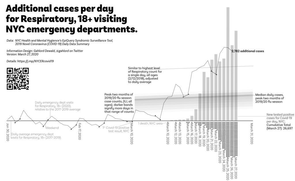
Definitions related to Estimating Future ER Load graph:
The actual data is the moving, lighter weight solid line beneath it. These points are calculated for each day based on the following from EpiQuery: ((Respiratory 18-64 2020)+(Respiratory 65+ 2020))-(Average((Respiratory 18-64 2017)+(Respiratory 65+ 2017)),((Respiratory 18-64 2018)+(Respiratory 65+ 2018)),((Respiratory 18-64 2019)+(Respiratory 65+ 2019))). Triangular points on the lighter weight line enclose weekends.
The bar chart shows the confirmed cases per day made by subtracting a given day’s total case count as reported in NYC Health & Mental Hygiene’s 2019 Novel Coronavirus (Covid-19) Daily Data Summary and subtracting the measurement obtained in the previous day.
Dots along the bottom indicate one death each. These are currently gathered via NYC Health & Mental Hygiene’s 2019 Novel Coronavirus (Covid-19) Daily Data Summary.
The loadband is a series of shaded bands. The darkness of the band indicates the number of days that many cases of ILI, all ages were generated within the Dec 12, 2019-February 15, 2020 timeframe. A median line is also present. This element is then transposed to the relevant date range and baseline. This loadband summarizes the peak months of the 2019/20 flu season activity for emergency departments in NYC. Data source is EpiQuery. See discussion of the baseline below re: why this is angled slightly.
The baseline is an average of people 18 and older, presenting Influenza-like Respiratory at a NYC emergency department 2017-2019. All lines and bars are relative to this figure in order to show variation from normal seasonality. Note that people reporting respiratory situations increases as the Spring comes on (allergies, etc). You can see the mild spring increase in the slight angle of the loadband and the peak performance line as these both represent static numbers vs the increasing level of the baseline.
FAQ on the NYC Respiratory ER graph
- Didn’t you used to chart vs Influenza-like Illness? Why did you switch to Respiratory? The messaging within NYC is now that if a patient has a cough or fever they should stay home. But if they have breathing problems, they should come in. As New Yorkers begin following that instruction the Influenza-like Illness case count may be decreasing, indicating a false decline in severity of the Covid-19 threat. Respiratory issues continue to climb and so I have switched. In addition, the aspect of Covid-19 that is most dangerous is respiratory as machines become scarce.
- Why do some of the lines slope up? This chart shows the increased workload in the emergency department. If Covid-19 were not in NYC people would still be coming to the emergency department for respiratory problems like allergies etc. The baseline of the chart is the average of 2017-2019 of each day. As spring arrives, slightly more people came in with respiratory issues in 2017-2019. The sloped lines of the loadband and the peak performance line are based on static numbers, so in order to show how much more than any given day’s daily average, they slope upwards.
- Why is the loadband talking about influenza-like illness when this chart is showing respiratory issues? Treating and interacting with a Covid-19 patient involves a workload similar to an influenza-like illness in that measures to prevent contagious spread must be taken, in fact far more so than usual influenza-like like illness. This chart element shows just how far above a recent past experience the emergency department is working.
- Is this all the deaths caused by Covid-19 in NYC? No. Covid-19 response takes up staff resources and ventilators etc. There are people who do not have Covid-19 but will die because there are no more ventilators left for them, no clean rooms to perform emergency procedures, no staff available to take them in. Additionally, there are people who will die because they do not go to the emergency department out of fear of catching Covid-19.
- What do you mean “additional?” The curved trend line and wavy actual data line represent how many more cases are showing up this year vs the average of 2017-2019. These numbers are only the additional–more than the average–that show up for the 18 and older people arriving at the ER reporting a respiratory (aka breathing) problem.
- What do you mean “Respiratory” symptoms? This is defined by the data set I’m using to make this graph, EpiQuery: “Respiratory includes ED chief complaint mention of bronchitis, chest cold, chest congestion, chest pain, cough, difficulty breathing, pneumonia, shortness of breath, and upper respiratory infection.”
- So it isn’t coronavirus for certain? No. It could be people just coming in because they are worried, for example. This project was initiated due to the lack of access, material, and permission for people in the United States to test and screen for coronavirus. This project is not helpful in a test/trace/treat system, unfortunately. It can only indicate what the burden of our medical infrastructure will be if it follows a given pattern.
- Is this the entirety of the increase we should expect to see? No. This is only people 18 and older. There will be a few people that are younger who show up as well (See Daniel Weinberger’s project in “Resources” below to look into different age and borough configurations of this data). Also, this is only people who show up in the emergency department. There will be people who come in for treatment via other channels. Also, this is only people who report a respiratory (breathing) problem. There will almost certainly be people who show up with other concerns such as shortness of breath. This graph shows only one, very narrow and specific group of people.
- I saw a different version of this graph where the wavy line was different, how come that is? After this data is entered it is continually refined for up to two weeks. Though I do not know why this is, my experience with data projects leads me to believe that any exhaustive data-gathering activity finds ands corrects errors afterwards. Each time I update the graph I use the most current data available in the web interface.