This article is part of the Syndromic Surveillance and Covid-19 collection on Thoughtfaucet.
This document outlines the thinking behind my initial chart, trying to see if there was anything to the idea that Influenza-like Illness could be used to spot Covid-19 in NYC.
A thread on Twitter by Farzad Mostashari mentioned EpiQuery, a data collection maintained by NYC Health. The data consists of emergency department visits broken down by date, coarse age groups, borough of New York City, and what sort of symptoms the person was reporting.
At the time (and continuing as of this writing) there has been a severe bottleneck in US residents having permission, access, and proper resources to test for Covid-19, the disease caused by the 2019 novel coronavirus. One hypothesis is that by using what we know about the disease combined with the data in Epiquery, we might be able to see the presence of it in NYC.
While using this method wouldn’t be useful for individuals–it doesn’t actually screen people for coronavirus–it can be useful to see how long it might be present and perhaps how prevalent.
I wanted to do a quick test and see if it was worth getting deeper into the NYC Health data to find Covid-19 and predict impact on emergency services. My concern was that we don’t turn out like Italy and face a collapse of emergency health in NYC.
Summary:
By using Covid-19’s observed bias towards being harsher on older people, I used a combination of EpiQuery’s age and Influenza-based Illness syndrome surveillance and found what appears to be an increase in people showing up at NYC emergency departments in mid-February.
What we know about Covid-19
First off, some characteristics of Covid-19 that we might be able to use in examining the public health data provided by Epiquery.
- Covid-19 is more aggressive on older people. Young people do not develop as many serious cases of Covid-19.
- It takes about 5 days from being infected by coronavirus for symptoms to arise. (BBC)
- It takes between 5-10 days for symptoms to become serious enough for someone to seek medical help.
- 6.1% of cases were administered mechanical ventilation. (NEJM)
- Median duration of hospitalization was 12 days. (NEJM)
- Once Wuhan, the city where Covid-19 first became prevalent, went on complete city-wide lockdown, it took about 12 days for the new cases per day to decrease. (JAMA, see figure 1.)
- Covid-19 cases double about every 6 days. If you have 100 cases on day 1, you will have 200 cases on day 6, 400 on day 12, 800 on day 18, 1600 on day 24 and so on.
The EpiQuery Data
It’s worth knowing about the EpiQuery data as well. It comes with it’s own stated limitations, which are important to review. In addition, the data has the following features, characteristics, and limitations:
- There are four age buckets: 0-4 (infants), 4-17 (children), 18-64 (working-age adults), 65+ (seniors).
- There is data specifically consisting of people who came to the emergency department with Influenza-like Illness symptoms: fever, coughing, etc.
- The data is posted two days after it is collected and then updated for the following few weeks.
- The data is 100% of NYC emergency department visits back through mid 2016.
What we know about the world during the 2019/2020 Coronavirus Pandemic
There are things about the world that are relevant to this data search as well:
- NYC has 5000 ventilators. (Politico, March 13, 2020)
- Flu season tends to be between December and February.
- Italy did not lockdown their country until around March 10. In terms of raw, reported case numbers they are about 10 days ahead of the United States.
- Italy has a very slightly older average population age than we do.
- Italy has more hospital beds per capita than we do.
- Italy’s medical services are collapsing resulting in a higher rate of death than in post-Wuhan China. (The Atlantic)
Important dates related to coronavirus
Here are some important dates for coronavirus and NYC:
- Dec 31, 2019: China notifies WHO of existence of coronavirus, Wuhan is locked down.
- Jan 21, 2020: First case of Covid-19 detected in the USA in Washington state.
- March 1, 2020: First case of Covid-19 detected in NY state.
- March 10, 2020: First death related to Covid-19 in NJ reported in Bergen County which is next to NYC.
- March 12, 2020: 95 confirmed cases of Covid-19 in NYC. (NYTimes), First death in NYC (Brooklyn).
- March 13, 2020: 154 confirmed cases of Covid-19 in NYC (NYTimes), Second death in NYC (Manhattan).
- March 14, 2020: 184 confirmed cases of Covid-19 in NYC (NYC Health)
Combining these things into something we can see
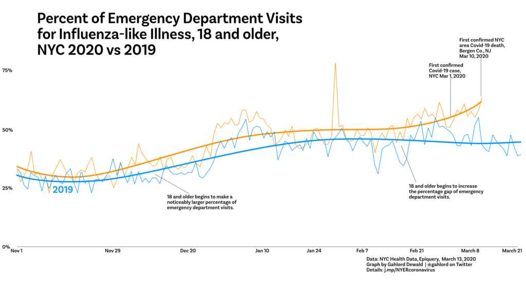
I wanted to know if we would really see anything at all with the data. The data contains case count, by age, of people who reported Influenza-like Illness at the emergency dept in NYC. I gathered this data for Nov 1-March 9 for both 2019 and 2020.
In a spreadsheet, I entered the case counts for each age bracket within the ILI syndromic surveillance data provided by EpiQuery. Then I calculated the percentage of the ILI syndromic surveillance counts for each age bracket. This is necessary because the ratio number provided by EpiQuery is vs all other emergency department visits. I wanted to know just within ILI, are the older people coming in more than they have in the past? My thinking is that since Covid-19 disproportionately effects older people the percentage of the Influenza-like Illness group would start to skew older as coronavirus spreads in NYC.
Using 2019 as a reference, I compared the percentage of people 18 and older seeking care for ILI symptoms to see if it deviated.
What’s in this initial, preliminary Coronavirus/NYC chart?
First obvious thing is a spike in the percentage on Jan 29. This was driven by a large number of cases reported that particular day (over 600 when typically it was in the 400s for the days preceding it). Not sure what that’s about.
After noticing that we can also see the “normal” flu season take off for this group around December and start to level off in January. This is visible in 2019 as well as 2020.
In mid-February, however, there is a second rise of cases for the 2020 18 and older age group while the 2019 data shows declining case percentage in February and March. The difference is pronounced by the time the first case in NYC is officially called on March 1, 2020.
While there are number of caveats–largest being that these are not diagnoses, these are just people self-reporting after arriving at emergency services–the data suggested it was worth going deeper to learn more and perhaps predict future impact on emergency services in NYC.
For my next chart I wanted to get a little deeper into the data so that something could be predicted about the future. In order to do that I needed to:
Clarify the pattern. Flu season creates a moving trend line as cases pick up for this group in December and begin to recede in January. I want to know how much additional strain is being put on the NYC emergency departments. Visualizing the difference across moving and waving lines can be difficult for some people. The new chart creates a straight base line consisting of the average. That way the curved line can tell us “what is the difference between what we see now and a normal flu season.”
Refine the question. A good information graphic deals with a specific question. My question for the previous chart was “Can we see anything that might be Covid-19 in the emergency department data?” and I felt like we could. This time I wanted to answer: “What will the impact be on the emergency department, for the coming weeks?”
Establish a better baseline. I made an average of our 18 and older, Influenza-like Illness emergency department visitors for 2017, 2018, 2019. That’s three years of data. 2017 and 2019 were relatively mild flu seasons. 2018 was not as mild. Between the three I figured this gives us a little more data to work with to establish what a flu season looks like without coronavirus. Having a better baseline increases trust that what we’re looking at isn’t just a random fluke of particularly bad or good year.
Focus the timeline on the relevant dates. Since the obvious split of the data wasn’t happening until after Valentine’s Day I decided to start with Jan 30 (which also passes over that spike in the data on Jan 29).
The impact can be discussed in terms of more or fewer cases than the average of 2017-2019. To do this we subtract the average number of cases 2017-2019 from this year’s cases. That lets us know if we’re seeing more cases or fewer cases than average. We can show the change in case load in the past. And perhaps, using other information, predict what it might be in the future.
Using the fact that Covid-19 cases double about every 6 days, I can take the most recent number of people showing up at the ER who are 18+ with influenza-like illness and double that number. Then go forward six days and subtract the average for that date from my doubled number. This gives me an estimate of what the difference might be
With those targets fixed out in the future I built a trend line that matches those targets.