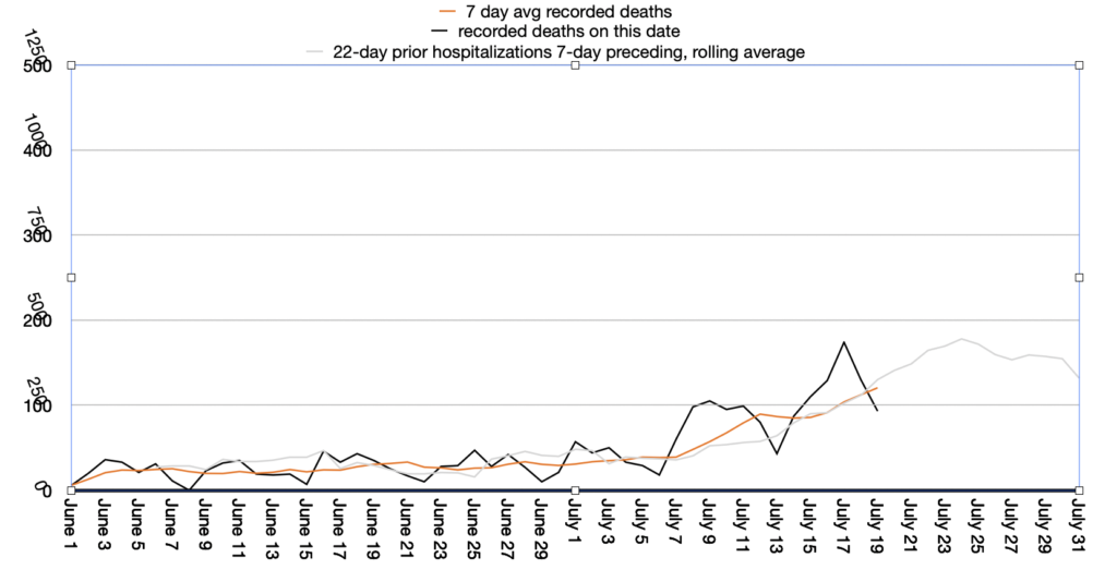
Here’s a graph of Covid deaths in TX since June 1, 2020. Black=daily deaths, orange=7-day average, gray=7-day hospitalization average from 22 days prior (scaled by 40%, roughly the mortality rate for hospitalized patients in this data) data: http://covidtracking.com

In NYC, the amount of time between hospitalization and death from Covid-19 was only 19 days. Also the mortality of hospitalized patients was worse. The lessons learned in NYC appear to be keeping patients alive longer. This is a double edged sword because more patients now will take up space in the hospitals–there will be fewer available beds. But obviously it’s good if more people are surviving!
While this graph suggests deaths will start to decrease at the end of the month it’s worth noting that it appears the hospitals are full in several locations in Texas. As a result there may be cases which should be hospitalized but won’t be due to lack of space or people not showing up at the ER in the first place. We saw this in NYC where many people died without getting medical care (i.e. deaths without hospitalizations). Hopefully that won’t happen in Texas but hope, while a good for one’s mental state, is not a great strategy.
This page is part of the Syndromic Surveillance collection at Thoughtfaucet.