Last Updated: April 28, 2020
The Covid-19 Graph (NYC) shows people arriving at the emergency department (case counts in the angled line), hospitalizations (bar graph), and deaths (dots below the base line). This graph uses syndromic surveillance to show the burden being placed on the NYC medical system. It is built with data from the NYC Health & Mental Hygiene Department.
In this graph we can see (potential!) new cases, people being treated via hospitalizations, and deaths in one visualization. We can see the relationship between actions, identification and treatment, and the societal burden of Covid-19 on New York City.
Definitions

The data from EpiQuery is the angular, lighter weight solid line. These points are the sum of ILI and Respiratory case counts for each day. Triangular points on the lighter weight line enclose weekends. Knowing which days are weekends helps to identify days which are often low due to human weekend patterns vs days which are low due to some factor with coronavirus.
There are two case progression measuring sticks. One is aligned with the first death in NYC. The other is aligned with the current day. The measuring stick combines data from articles in Annals of Internal Medicine and The Lancet Infectious Diseases (see Resources, linked below). This tool is useful for understanding why deaths may increase for some time even though the case count of ILI + Respiratory are falling.

The bar chart shows new hospitalizations per day made by subtracting a given day’s total hospitalizations as reported in NYC Health & Mental Hygiene’s 2019 Novel Coronavirus (Covid-19) Daily Data Summary (Hospitalizations) and subtracting the measurement obtained in the previous day.
Dots along the bottom indicate one death each. These are gathered via NYC Health Department’s 2019 Novel Coronavirus (Covid-19) Daily Data Summary. Note: As of April 14, 2020, NYC Health Department reports on confirmed Covid-19 deaths (those who have tested positive) and probable Covid-19 deaths (Covid-19 or equivalent on their death certificate but have not been tested). On this graph, deaths after April 13th include both categories of deaths.
The baseline is the average of people 18 and older (summed from demographic data in Epiquery), presenting Influenza-like Illness and Respiratory cases at a NYC emergency department 2017-2019. All lines and bars are relative to this figure in order to show variation from normal seasonality. ILI usually has a February peak, Respiratory has similar peaks but also rises gently as Spring arrives.
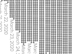
The loadband is a series of shaded bands. The darkness of the band indicates the number of days with the amount cases of “ILI and Respiratory, all ages” were generated during the peak of the 2018 flu season ( Jan 5 2018-February 28, 2018). Median and peak lines are also present. This loadband summarizes the peak months of the 2018/19 flu season activity for emergency departments in NYC. The data source is EpiQuery.
FAQ on the NYC ER graph
- What’s the difference between confirmed deaths and probable deaths? Confirmed deaths are those who have been tested for coronavirus and confirmed positive. Usually confirmed deaths occur in a hospital or other medical system environment. Probable deaths are those with “covid-19” or equivalent listed as the cause of death on their birth certificate but have not been tested. Probable deaths most often occur at home. Due to unequal access to health care, crowding of the healthcare system at the peak of the March/April 2020 Covid-19 outbreak, and other factors, many New Yorkers may have chosen to forego medical assistance for Covid-19 and as a result died without being tested.
- Why do you combine ILI and Respiratory syndromes in this graph? My purpose in designing this chart is to show increased load on the medical system. Covid-19 has elements which present as either ILI or Respiratory and people arriving at the emergency department for either syndrome will need to be treated with the additional precautions of a Covid-19 case.
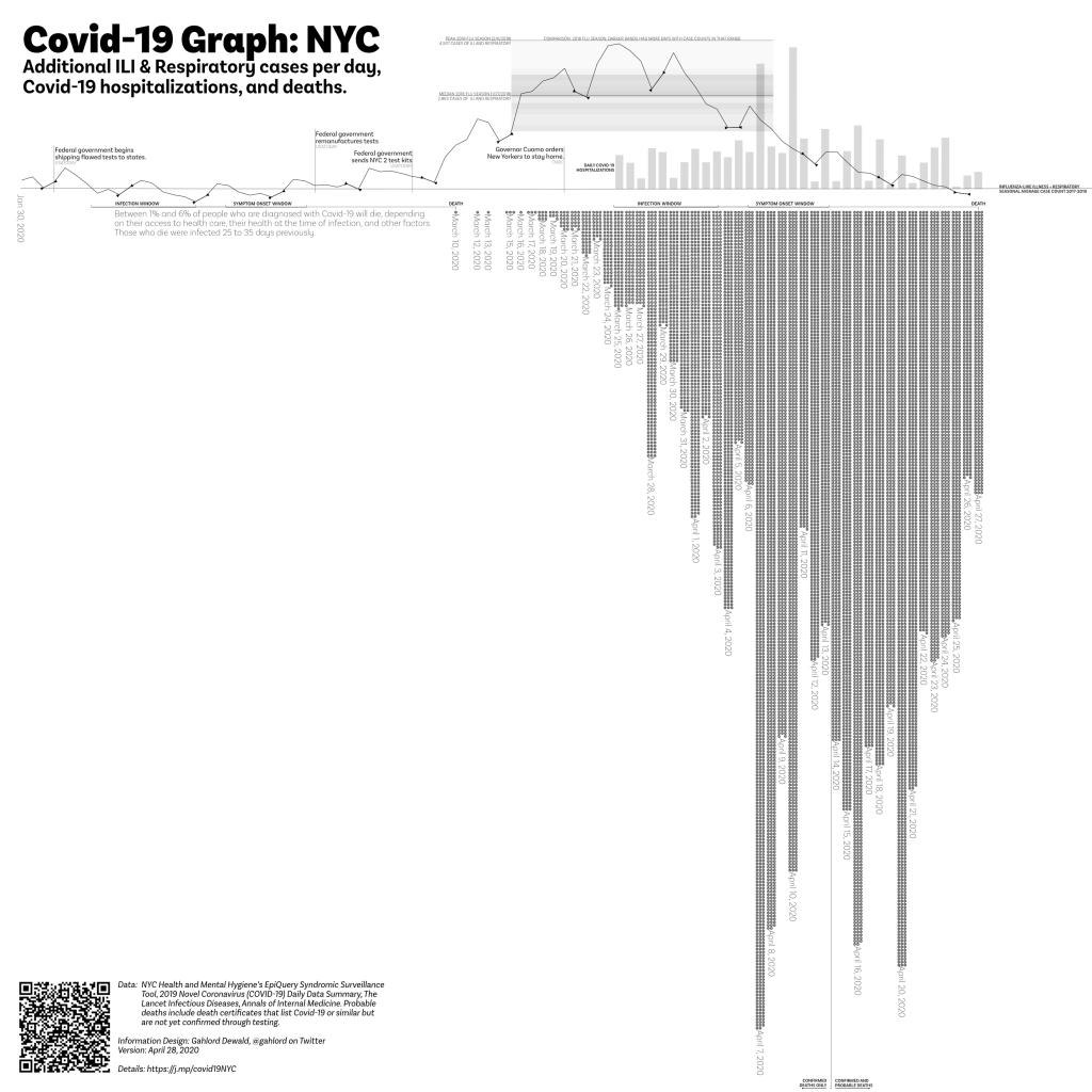
- Is this all the deaths caused by Covid-19 in NYC? No. Covid-19 response takes up staff resources and ventilators etc. There are people who do not have Covid-19 but will die because there are no more ventilators left for them, no clean rooms to perform emergency procedures, no staff available to take them in. Additionally, there are people who will die because they do not go to the emergency department out of fear of catching Covid-19. Finally, the unusual and unseasonal rise in cases for ILI and Respiratory begins around February 15th. It is quite likely that people were dying of Covid-19 during the time in which NYC was unable to test thoroughly. These people will not be represented on the Syndromic Surveillance Covid-19 Graph (NYC). Were authorities to go back to pneumonia/influenza deaths between February 15th and March 10th there would almost certainly be more deaths from Covid-19 identified. There will be many who won’t be counted due to the lack of testing.
- What do you mean “additional?” The angled data line represent how many more cases are showing up this year vs the average of 2017-2019. These numbers are only the additional–more than the average–that show up for the 18 and older people arriving at the ER reporting a respiratory (aka breathing) problem or an influenza-like illness (fever, coughing, sore throat).
- What do you mean “Respiratory” symptoms? This is defined by the data set I’m using to make this graph, EpiQuery: “Respiratory includes ED chief complaint mention of bronchitis, chest cold, chest congestion, chest pain, cough, difficulty breathing, pneumonia, shortness of breath, and upper respiratory infection.”
- What do you mean “ILI”? ILI is an acronym which, used in medical culture, stands for Influenza-like Illness. EpiQuery, the data source for syndromic surveillance aspect of this chart, defines ILI as “ILI includes ED chief complaint mention of flu, fever, and sore throat.”
- So it isn’t coronavirus for certain? No. Syndromic surveillance and Covid-19 are not an exact one-to-one match. It could be people just coming in because they are worried, for example. This project was initiated due to the lack of access, material, and permission for people in the United States to test and screen for coronavirus. This project is not helpful in a test/trace/treat system, unfortunately. It can only indicate what the burden of our medical infrastructure will be if it follows a given pattern.
- Is this the entirety of the increase? No. This is only people 18 and older. There will be a few people that are younger who show up as well (See Daniel Weinberger’s project in “Covid-19 Syndromic Surveillance Resources” to look into different age and borough configurations of this data). Also, this is only people who show up in the emergency department. There will be people who come in for treatment via other channels. Also, this is only people who report a respiratory (breathing) problem. There will almost certainly be people who show up with other concerns such as shortness of breath. This graph shows only one, very narrow and specific group of people.
- I saw a different version of this graph where the angled line was different, how come that is? After this data is entered it is continually refined for up to two weeks. Though I do not know why this is, my experience with data projects leads me to believe that any exhaustive data-gathering activity finds ands corrects errors afterwards. Each time I update the graph I use the most current data available in the web interface.
The Covid-19 Graph (NYC) is part of the Syndromic Surveillance and Covid–19 collection of articles at Thoughtfaucet. Please see the Caveats section in particular to better understand the limitations of data and methods.
Great job!
Looks like deaths peaked 4/7, do you expect that deaths will continue to decrease?
As this response (April 13) I don’t think we’re ready to call it a peak in the deaths yet. I hope that it is, and if it is then it’s the result of incredible work on the part of NYC ED workers.
I’ll feel better about saying “yeah deaths will continue to decrease” once that onset window is clearly past the peak in syndromic surveillance case counts.
Using the measuring stick with the “deaths” on any given day will show you when the cases were hospitalized in the “onset window.” The lower deaths days following April 7th include three weekend days–days where fewer people showed up to get put into the system. I think this is one reason we’ll have some lower days.
Also, I suspect a lot of New Yorkers who were sick chose to not go to the emergency room at all. They know from reports that there are lines, that it’s crowded, and that supplies are low. This will lead to many many more deaths that we won’t learn about until later. You can read about this in the “context” section of the Resources page related to the Syndromic Suveillance Covid 19 collection.
A third reason to caution against declaring a peak is that the deaths in this chart are pulled from the NYC Public Health evening data summary. This summary is not always released at the same time, so some days it might be as early as 4pm and others as late as 6:30pm. This timing difference will have a result on any specific peak moment for deaths (and hospitalizations which also uses that data source). Instead it’s better to watch for a sustained trend. Given that Covid-19 appears to have a 14 days or so window between infection and symptom onset I’d want to see a trend of 14 declining days in a row before declaring anything a peak.
A fourth reason I’d hesitate to declare a peak in deaths is that this data is ultimately very human. Each dot on the graph is the outcome of a tremendous struggle on the part of an individual patient, many individual healthcare workers, individual staff who clean and service the environment, family and community members who influence the life of the individual patient, healthcare administrators working to procure adequate supplies in a challenging reality–at times having to compete against their own federal government, and the people who encode the data and maintain it. When confronted with this entirety of a human system I feel it is important to maintain as much humility about the data as possible, it is generated at great cost and represents a loss of wealth and experience. Any small adjustment to the human systems of care can have an impact on whether 4/7 was a peak or not.
Thanks for taking the time to review this and ask your question, Jonathan.
Wow you were right, deaths came roaring back – yet Cuomo reckons NY State is past the peak https://www.nytimes.com/2020/04/18/nyregion/coronavirus-new-york-update.html
could he be right?
Hello Jonathan, thanks for reading and asking another good question.
To be fair, data I had available prior to April 14 was only confirmed deaths. After that we now have confirmed and probable. Eventually I’ll average the probables from prior to April 14 into the earlier sections. That April 7 zone will probably still remain at the highest level of deaths per day though.
I expect from here on out there will be a slow decline in the deaths per day. The reason I expect this is because the measuring stick shows that deaths today were likely the result of infections happening around when Cuomo issued the stay-home directive. So from here on out there will be fewer infections caused leading to fewer deaths overall.
I think that, so long as the stay-home remains in effect, NYC is past the peak of new cases. There will continue to be hospitalizations at a high level for another week or so. Deaths will slowly decline, hopefully quickly as hospital capacity recovers. I don’t know about the NY State data so much, but it’s likely far overshadowed by what is happening in the city.
Though new case counts/intakes, hospitalizations, and deaths are all connected, they peak at different times. First intakes begins to come down (as appears to be the case right now), then about a week later the hospitalizations comes down, then about a week after that the deaths will start to come down.
I would call where we are now more a detente than anything: new cases declining, but hospitalizations still very intense, and soon declining deaths but it will be a week or more of high deaths.
For comparison, a normal regular day in NYC has 25 deaths. We haven’t seen fewer than 25 deaths via Covid-19 since March 21st. Deaths from March 21st were likely the result of infections that began around February 17. So to get back to that level–and remember that 25 Covid-19 deaths/day is effectively doubling NYCs mortality per day–the intakes (case count line) needs to be in the same general zone as around Feb 17.
Without a vaccine, if we open up again as a very few are clamoring for, we will be right back up in the high numbers of deaths within a few weeks of opening up.
tldr; we may be past peak but there’s a long way to go until it’s safe.